
SALONIZED
From brand identity to a working system.
Turning a newly launched visual identity into a functioning brand system that could support the company's rapid growth, scaling from 20 employees to 50+ within a year.
DELIVERABLES
Art Direction
Motion Design
Digital
TOOLS
Photoshop
Illustrator
Figma
ROLE
Brand Designer
Motion Designer

CONTEXT
I joined shortly after a rebrand. However, the company's existing brand guideline was outdated and lacked critical information. This left room for inconsistencies and confusion, making it difficult for designers and non-designers to maintain a cohesive brand identity online and offline.
OPPORTUNITY
To create cohesiveness and consistency on our communication channels. To build creadibility while facing our clients and partners. To fabricate a strong ever-lasting identity.
CHALLENGE
How might we...
Bring more structure to recurring design requests and an underdefined brand identity to better support business needs and growth?
The Approach
A new visual identity,
but not yet a usable system.
By the time I joined, the company had completed its rebrand, but the visual identity was still more of a creative direction than a practical system. The guidelines offered little instruction on application. Before teams could effectively activate the brand, they needed clarity on both how to use it, what resources were already available and what needed to created.
 |  |  |  |
|---|---|---|---|
 |  |  |
Before
The pre-existing brand book consists of
6 pages, including a text-free cover.
Creating a clearer
brand framework.
For this revamp, I initiated a thorough research process to understand the company's history, culture, and vision. I conducting interviews with creative teams and collected available fragments from the old brand guideline and cross-referenced them with industry best practices and design trends.


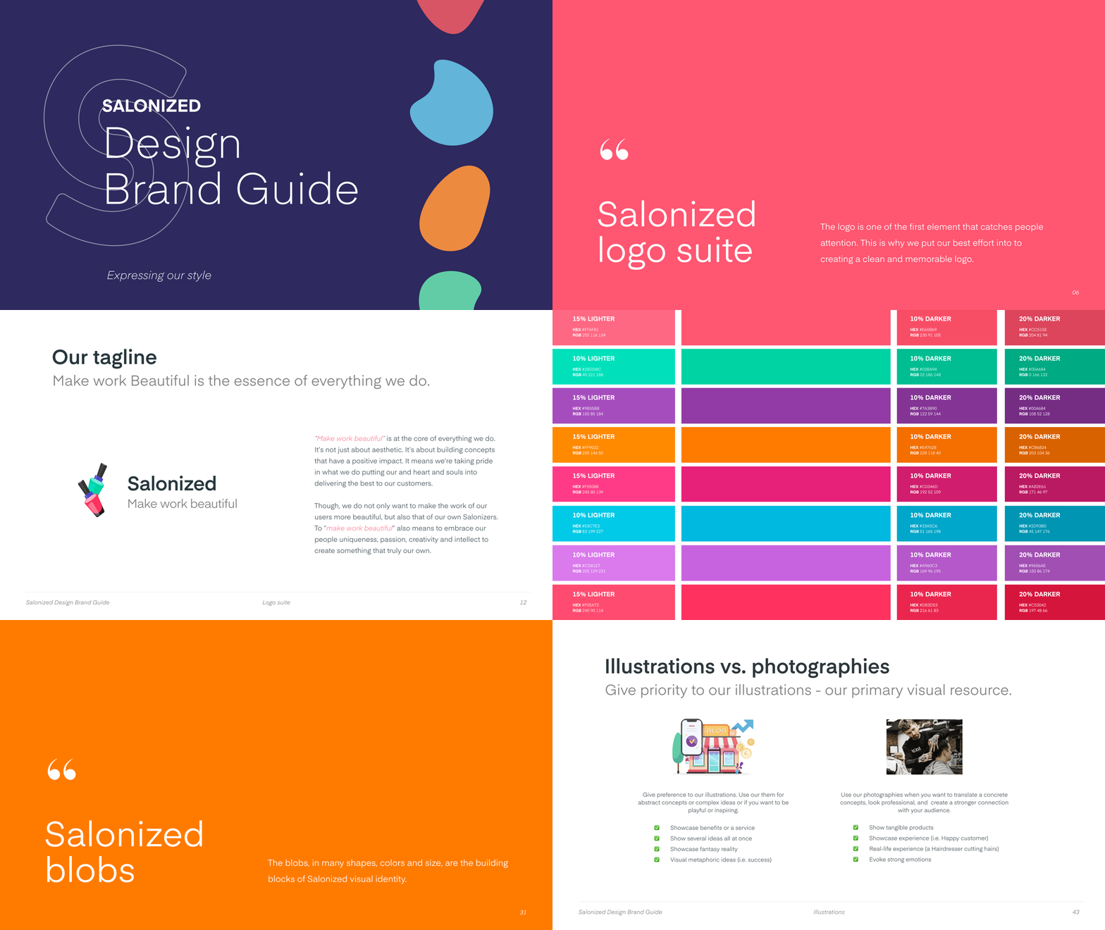
After
The user-friendly nature of the brandbook enabled non-designers to confidently create on-brand content, bolstering the company's overall brand image.
Side-by-side comparison
Before, teams lacked practical guidance on how to apply the new brand identity to different needs, while existing assets and collateral were scattered across folders, making them difficult to find and reuse.
Building on the existing creative direction, I translated the visual identity into practical guidelines, creating a shared reference to help teams apply the brand consistently across touchpoints.
BEFORE
AFTER
Company story
Logo
Logo alternative
Tagline
Colour palette
Font
Social media
Illustrations
Photographies
Templates
Business card
Flyers
Resources link
Contact info
✘
✓
✓
✘
≈
≈
✓
✘
✘
✘
✘
✘
✘
✘
✓
✓
✓
✓
✓
✓
✓
✓
✓
✓
✓
✓
✓
✓
Making “Can you send me…?”
a thing of the past.
When growth outpaced design, I approached it as an opportunity to create, together with the illustrator, a centralised asset library that brought existing brand resources together in one place, giving designers and non-designers the tools to find, adapt, and export assets independently.

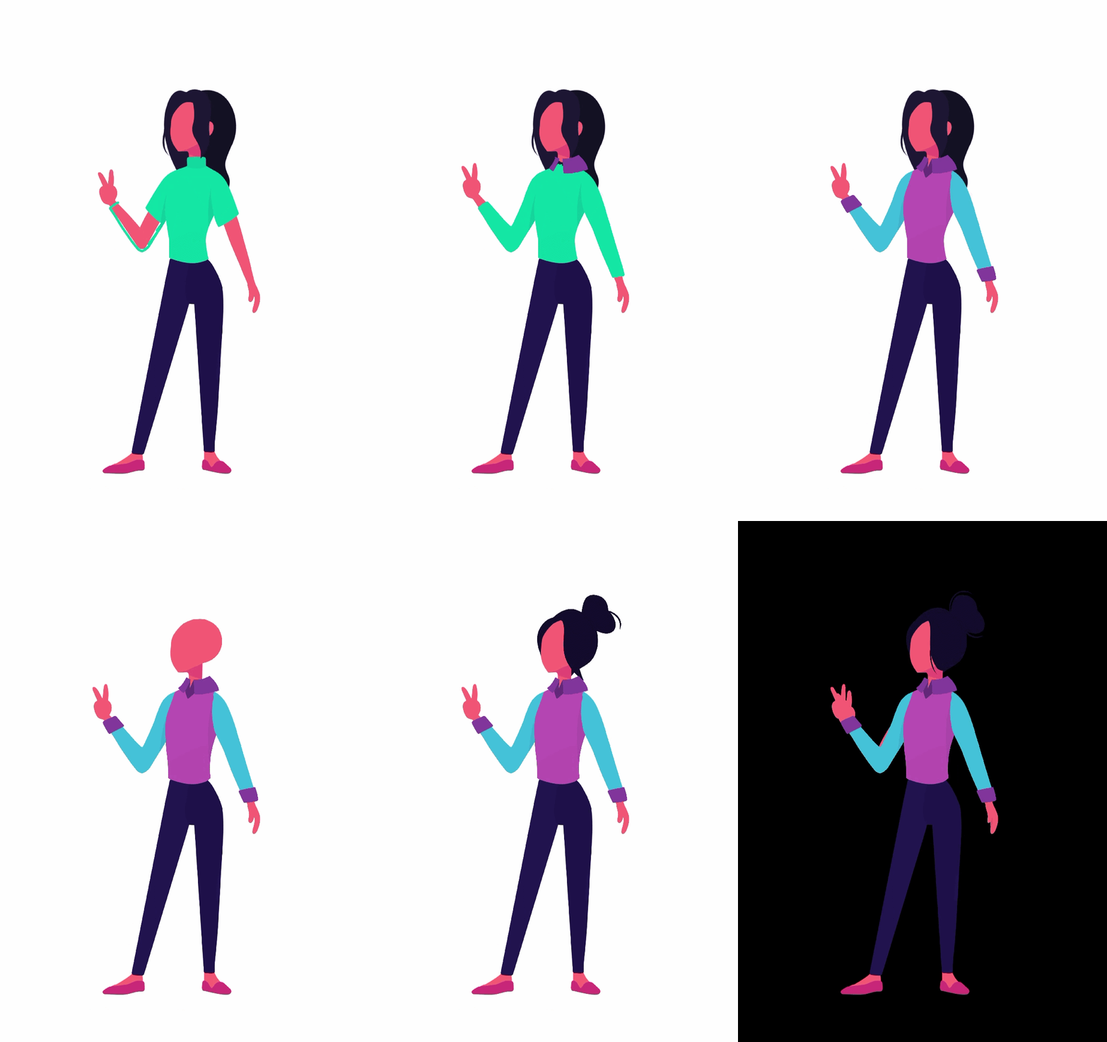


Rather than recreating visual elements from scratch, could we rely on reusable assets?
Assets Library
The asset library brought templates, icons, and illustrations together in one centralised location, making them easily accessible to everyone.


Creating a clearer path
from request to delivery.
As the sole designer, I also needed a clearer way to manage competing priorities across teams. This the reason why, I introduced a centralised design request form to bring visibility to incoming work, align stakeholders, and support more informed prioritisation.

The Impact
How the brand work in practice.
I identified the gap between the newly established brand identity and its day-to-day use, then helped close it by developing three solutions:
1.
2.
3.
Clarify: clearer guidance on how to interpret and apply the identity, helping make the brand more consistent across touchpoints.
Enable: an accessible asset library that reduced repetitive requests and enabled colleagues to work more independently.
Structure: a design request system that improved visibility into incoming work, workloads, and prioritisation.
Good brand systems don't just create consistency. They make consistency easier to achieve. Here are 3 examples of how this new approach came to life:
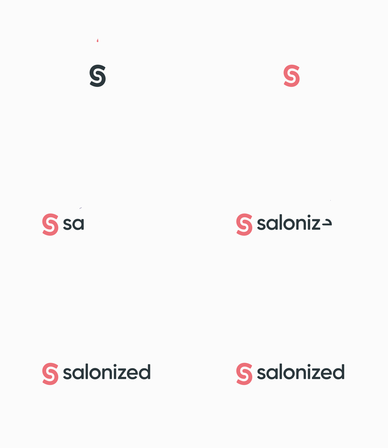

The brand in motion
I co-created animations for our digital channels, establishing a more consistent visual language for online content.
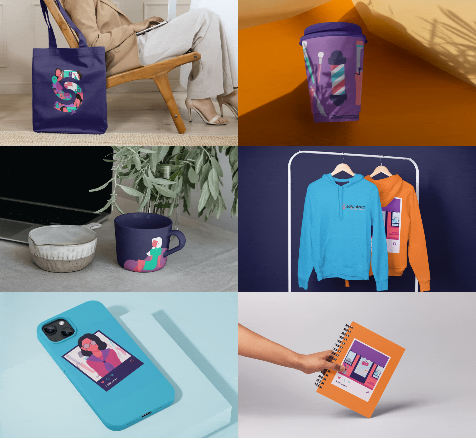
The brand in your hands
I designed a range of branded merchandise and physical assets for customers, prospective clients, extending the brand into touchpoints people could take away and remember.
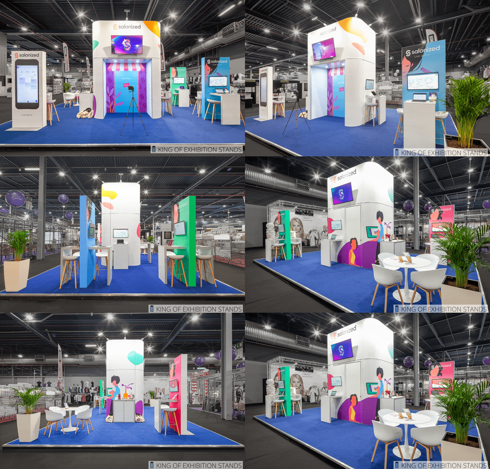
The brand on-site
I collaborated with the illustrator to bring the visual language into the physical event space, ensuring that the brand remained recognisable and coherent.